Dressing Shelves
The shelves in our previous living room had been a tad neglected and had managed to accumulate various items that did not belong. This coupled with the addition of the box of Christmas decorations that hadn’t quite made it into the hall cupboard created a corner that was far from the personalised beautiful display Lorna had envisioned when we first moved in to our flat.
Lorna decided to deal with the situation in a creative yet scientific/forensic manner… Hopefully this will inspire you and give you some tips to create your own personalised displays.
Process
1: Look at your existing set up and assess what you like and don’t like about the display. Lorna liked the items that had been grouped together in the magical rule of three (for those unfamiliar with this, many believe that objects grouped in uneven numbers, preferably 3 items, are more aesthetically pleasing to the eye than items grouped in even numbers). Lorna also wanted to use items that reflected things that were important to both herself and Neil and use items of similar tones and materials throughout to create a cohesive display.
2: Take everything off the shelves and give it a good clean.
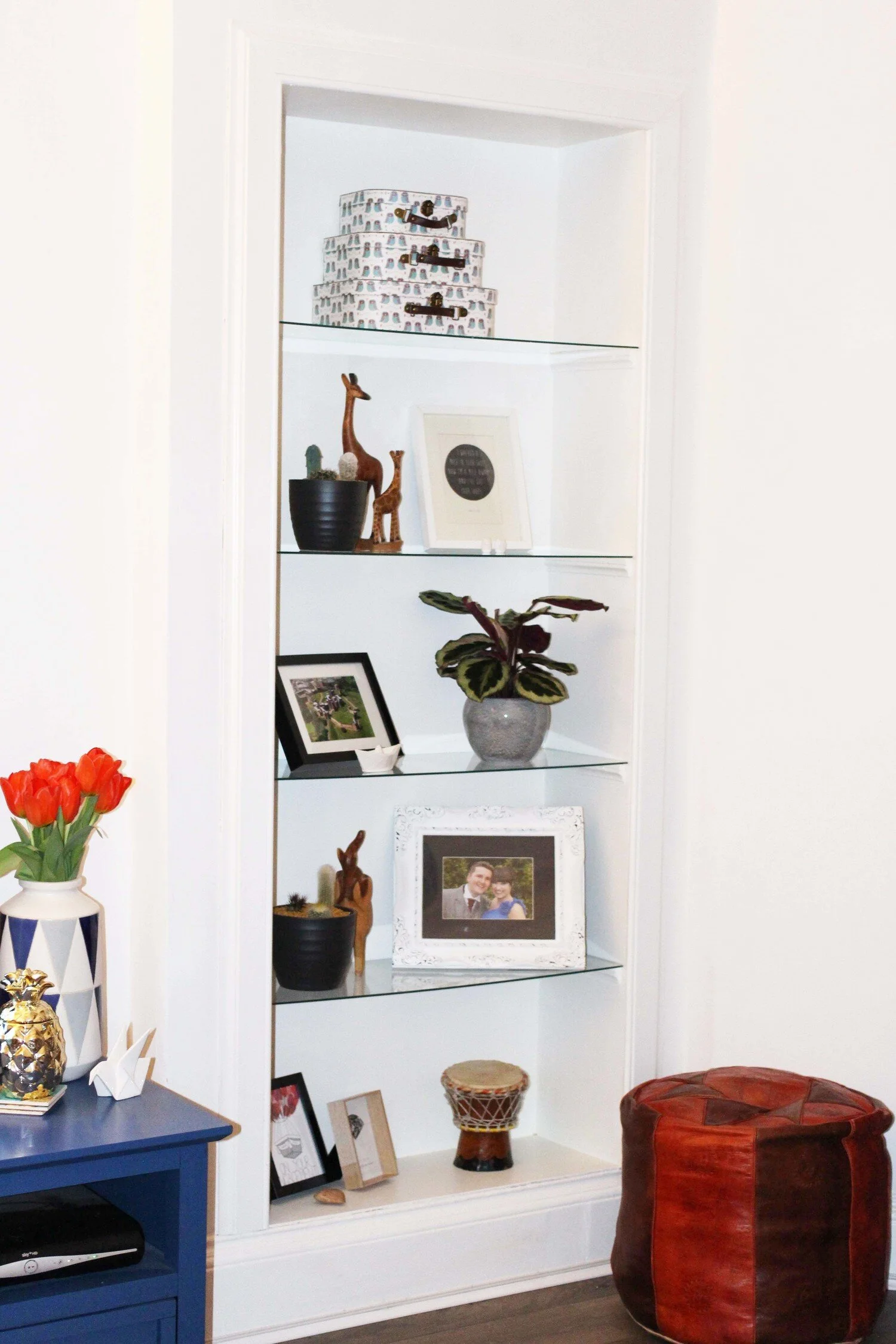
3: Start placing objects on the shelves, Lorna decided to start by creating the groups of objects she still liked from the previous display like the cactus pots and wooden animal combinations.
4: Take one shelf at a time and step back to look at the display from all angles.
5: If you like a combination on the shelf but it doesn’t work with the rest of the shelf combinations try it on a different level.
6: Keep trying different combinations until it starts to take shape.
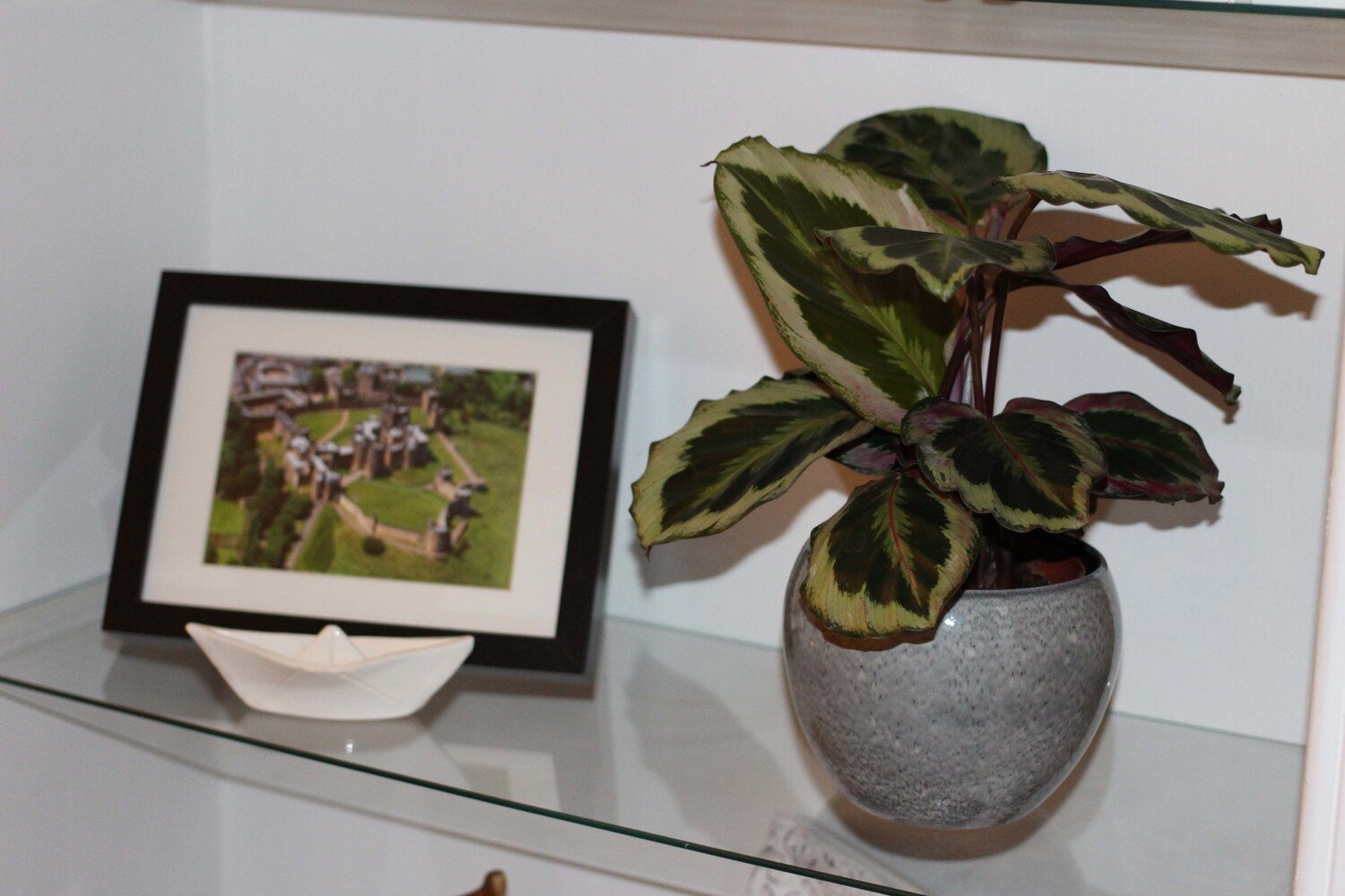
7: If you feel that something is missing, try shopping about your own home for the perfect item. This middle display was missing something so Lorna ‘bought’ an item from the bedroom (the ceramic paper boat) to add underneath our engagement location photo.
8: If something looks wrong but you can’t quite put your finger on it, try living with it for a couple of hours/days to see if inspiration hits. Lorna felt something wasn’t quite right with the display, and then when she was at the home garden centre choosing a valentine’s gift from Neil she found the perfect plant which was the perfect finishing piece to the display.
Design Analysis
After creating the display Lorna decided to analyse exactly what it was that she liked about it in the hope that maybe you can pick up some useful hints and tips to help you with your own displays.
Rule of 3
Objects are loosely grouped into smaller displays of 3, as it can be more aesthetically pleasing.
Juxtaposed Symmetry
On each shelf Lorna alternated the side that a picture frame is located on to add balance to the overall composition, although she did add interest by each frame being a different type, colour, size and orientation.
Colour/Material Palette
Lorna created a natural colour palette of white, grey, green, and tones of brown and incorporated all of these colours into each shelf to subliminally co-ordinate the shelves and unify them.
Various heights
Each shelf also incorporates elements of various heights to add visual interest. The reason why the plant works so much better on the middle shelf than the golden pineapple is because it adds height to the shelf.
Space
Remember the beauty of the white space, each group of objects has space in between to allow the eye to easily take in each object and for the whole display to not feel too cluttered.
These hints and tips are what worked for us and what Lorna found visually pleasing in this particular space, but feel free to try out your own combinations and share them with us. Remember they are only objects and if you don’t like how they look you can always take everything back off the shelf and start again. Have fun with it and tweet us your shelving displays @HouletStudio


